No products in the cart.

The Iowa Darts design has been a favorite since 2017. The initial request from the client was to have a design based around the state of Iowa that coincided with their logo. Doing themed jerseys based on locations can be a very difficult task, especially when easy ideas like landmarks are not widely available. To pull off this design the focus for the designer started on the corn from the logo and inspired the beautiful silhouette of a cornfield in the the evening sunset. What really pulls this design together and exhibits the designers eye for perfection is the rustic grey barn door in the background. This design easily peaks the top 50 as it is a great example of a design excellence and professional execution of a jersey design based on just a logo and graphical element.
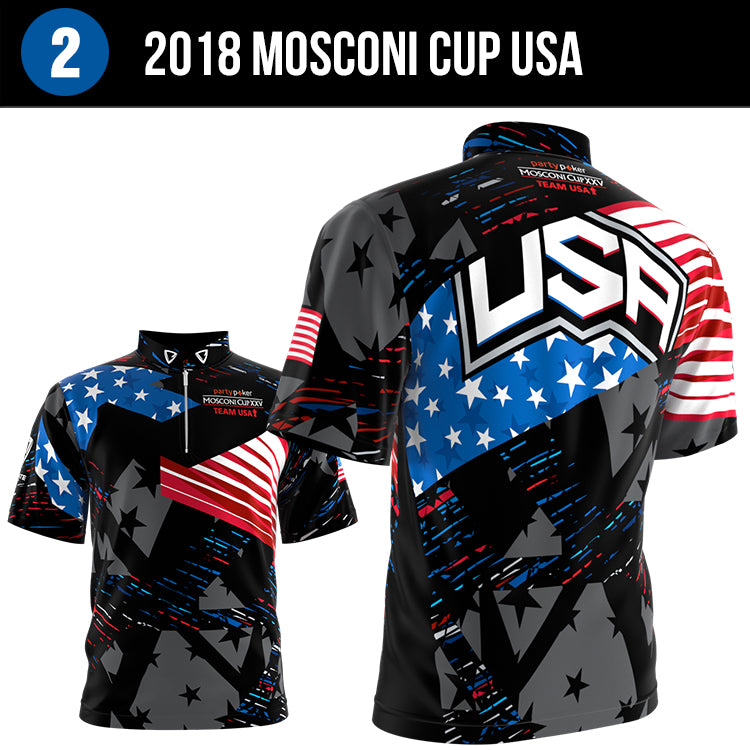
A televised billiards event on ESPN and SkySports that reaches over 80 million viewers, Ultimate Team Gear has been a proud sponsor of the Mosconi Cup for the past 4 years. While we do many USA themed jerseys, this jersey was designed in a very special way and makes it our #2 pick.
There is a lot of pride in this design because the 2018 Mosconi Cup line of jerseys were designed taking into consideration how the colors are transferred through the television. While we see many of our designs in person and in pictures, seeing our clothing on broadcast tv really sheds a light on how color is received through the camera lens. Many factors were taken into consideration when designing this jersey, from the contrast of the inks to the lighting in the arena. We have been very lucky to be a part of 14 events that have been broadcasted around the world giving us the opportunity to keep improving our product. We consider this innovation, designing for a platform to keep intact the power of color and design. With the effort and beauty of this design it is easy to see why it is on the top of our favorites list.
There is a lot of pride in this design because the 2018 Mosconi Cup line of jerseys were designed taking into consideration how the colors are transferred through the television. While we see many of our designs in person and in pictures, seeing our clothing on broadcast tv really sheds a light on how color is received through the camera lens. Many factors were taken into consideration when designing this jersey, from the contrast of the inks to the lighting in the arena. We have been very lucky to be a part of 14 events that have been broadcasted around the world giving us the opportunity to keep improving our product. We consider this innovation, designing for a platform to keep intact the power of color and design. With the effort and beauty of this design it is easy to see why it is on the top of our favorites list.

#3 on our list is an exceptional concept design presented to Molson Coors Light. Coors Light is a massive world wide brand and to have the opportunity to create and present our ideas was very exciting for the designers. This design is professional, fresh and provides the core branding needed for the client. So what makes this design so special that it sits at the #3 spot in our top 50? The designer found creative ways to convey the strong Coors Light brand without any inspiration provided from the client. The details of the rocky mountains with the light blue on the mountain tops to reflect optimal drinking temperature is a nice touch and adds color to what is a very clean and picturesque design. The grey skies above the mountains is a great execution of blending of two light colors to fill space and maintain a clean look. To do all this without any assets exhibits a level of resourcefulness from a true professional. This design amazing, sexy and worth a spot in the top 3.


CALL US
(206) 397-0337

NEED HELP WITH BUYING?
shop@UltimateTeamGear.com

SEND E-MAIL
support@UltimateTeamGear.com